Brand kit
The Aegis Designs visual identity, design principles, and brand standards.
Logo
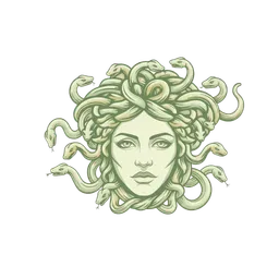
Usage guidelines
Minimum size
Logo must be at least 100px wide.
Clear space
Maintain 2x clear space around the logo.
No distortion
Never stretch, skew, or rotate.
No effects
No drop shadows, glows, or outlines.
Approved colors
Only use the 11 canonical brand colors.
On photography
Use a dark overlay behind the logo.
Neutral ladder
Page → card → hover → border → gradient stop.
Forest floor
#0A0F07
Page background
Deep moss
#111A0D
Card surface
Field shadow
#1A2613
Hover surface
Olive rule
#2A3821
Default border
Field deep
#3D4F2F
CTA gradient stop
Accent ladder
The single accent. Capped at 10 percent of any visible surface.
Field olive
#5A6B47
Primary action, eyebrow chip
Field olive warm
#6B7D55
Primary action hover
Voice ladder
Text, link, and stat color on the dark field.
Moss
#8B9D78
Muted text, eyebrows
Sage
#B5C4A1
Links, stat numbers, headline accents
Sage light
#D4DCC8
Sage CTA hover
Paper
Pure white is the documented Aegis exception. It carries the primary text on the dark field and the contrast surface inside the primary button. No other surface uses it.
Paper
#FFFFFF
Primary text on dark, contrast surface inside the primary button
Typography
DISPLAY
Aegis Designs
Cormorant Garamond, serif · 64px · 300
HEADLINE
Systems that scale
Cormorant Garamond, serif · 42px · 300
TITLE
Operational clarity
Inter, sans-serif · 16px · 500
BODY
We replace manual chaos with reliable, automated workflows so owners can scale with clarity and control.
Inter, sans-serif · 15px · 400
LABEL
AUTOMATED WORKFLOWS
Inter, sans-serif · 11px · 400